
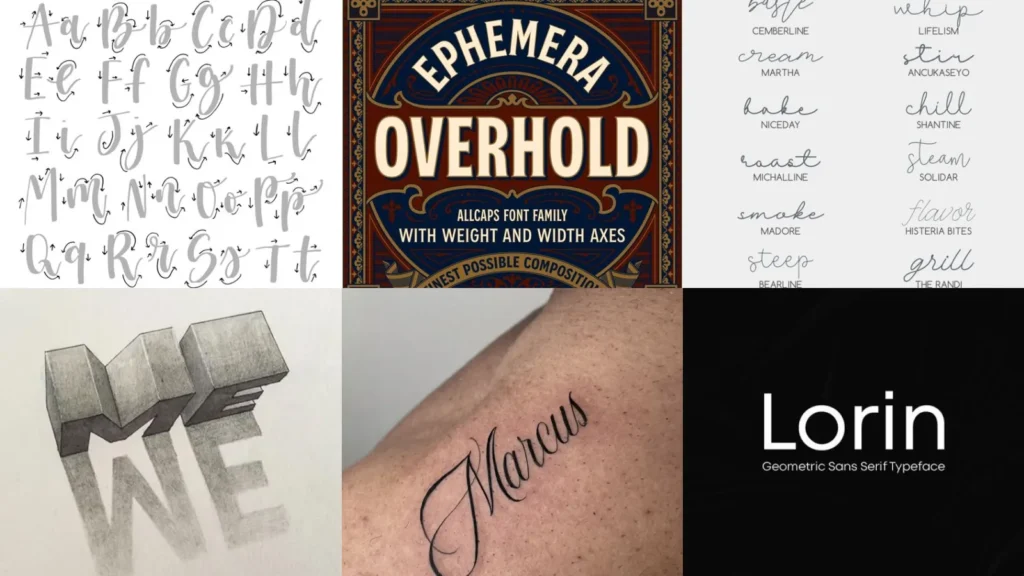

This list is for total beginners, busy people and anyone who just wants their handwriting to look a little more special. You don’t need fancy pens or an art degree for a single one of these!
I scrolled through way too many pins to put this together, honestly hundreds of them! I only kept the styles that looked doable with things you probably already own, plus a few that just made me stop scrolling.
Some of these work great on journal covers. Others belong on kitchen chalkboards or little bookmarks tucked into a paperback.
Renters will love the ones that need zero commitment, just paper and a pen. No painting a wall, no permanent marker disasters, lol!
Lettering ideas can look intimidating online but most of these break down into a few simple strokes. Practice one for ten minutes and you’ll already see a difference!
Work through the list in any order you like. Under each one I’ve added the little details you actually want to know, plus a link to a full tutorial.
LETTERING IDEAS
Bubble Letter Alphabet Practice

We’re starting off strong with bubble letters, the gateway drug of lettering, haha! I doodled these in the margins of every notebook I owned as a kid.
Outline the word in pencil first, then trace a puffy border around each letter. Guessing at the shape never ends well!
Erase the inside lines and you’ve got instant volume.
- The one everyone already knows
- Just needs a pencil and paper
- Great for margin doodles
- No blending required
Faux Calligraphy Brush Pen Style

Faux calligraphy is basically cheating. I mean that as a compliment!
You write in regular cursive, then thicken the downstrokes with a second pass of your pen.
It looks fancy but takes zero special tools. Who doesn’t love a shortcut like that?
- The fake it till you make it method
- Works with any regular pen
- Downstrokes only
- Ten minutes to get the hang of it
Watercolor Wash Lettering Quote

How pretty is this watercolor wash lettering? The background gets painted first in loose, wet strokes, then the words go on top once it dries.
Turns out it was a cheap craft store set the whole time, lol!
- The pretty background does the work
- Craft aisle watercolor set works fine
- Let it fully dry first
- Looks fancy framed
Vintage Serif Lettering Banner
This vintage serif banner style looks like it belongs on an old circus poster. Thick serifs, a curved banner ribbon underneath, the whole nostalgic package!
I always underestimate how long the ribbon folds take me. Worth every minute though, especially framed in a thrift store frame.
- Old timey and proud of it
- Thrift store frame finishes it
- A little more patience needed
- Great gift for grandparents
Floral Wreath Lettering Design

Floral wreath lettering wraps tiny painted flowers around your word instead of a plain border.
Draw the word first, then sketch little leaves and blooms curling around the letters. Not that I’m biased toward this one or anything, haha!
It only takes a few extra minutes to add the blooms.
- The one that doubles as wall art
- Draw the word before the flowers
- Nice on a greeting card
- Works with markers or paint
Chalkboard Lettering For Kitchen Sign
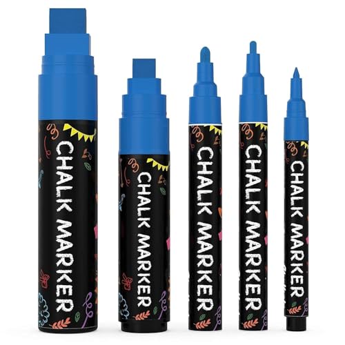
Is a kitchen even a kitchen without a chalkboard sign somewhere? Not in my book!
This style leans into thick, dusty strokes that look great from across the room.
A cheap chalk marker holds up so much better than actual chalk, by the way! Less mess, less smudging, no chalk dust on the counter.
- The one that hangs by the stove
- Chalk marker beats real chalk
- Wipes clean for new quotes
- Reads well from across the room
Bounce Lettering Cursive Style
Bounce lettering just means the letters sit at slightly different heights instead of marching in a straight line. It looks playful and honestly a little chaotic, in a good way!
This one takes some getting used to since our brains want everything level. Give it a page of practice and it starts feeling natural.
Some folks pick it up in a single afternoon.
- The playful line breaker
- Letters sit at different heights
- Takes a page of practice
- Great for casual quotes
Monoline Script Journal Cover

Monoline script keeps the same line weight the whole way through, no thick and thin strokes to worry about. This makes it the easiest cursive style on the whole list!
I’ve made entire journal covers with nothing but a gel pen from my junk drawer. Clean looks that ask nothing of you, my favorite kind.
- The no thick no thin option
- Clean on a plain notebook
- Easiest cursive style here
Rainbow Gradient Lettering Poster

Rainbow gradient lettering is loud in the best way possible! You blend colored pencils or markers side by side so the word shifts from one shade into the next.
My blends always come out messier than planned, but that’s basically the whole trick. The messier it looks, the more intentional it reads, lol!
- Loud and proud on the wall
- Blend colors side by side
- Messy blending looks intentional
Minimalist Modern Script Print
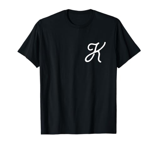
Sometimes less really is more. This minimalist script uses one thin line, one color and a whole lot of empty space around it.
It’s the print I’d actually frame in my own apartment, plain white mat and everything. Simple, quiet and somehow still eye catching, am I right?
- The quiet one on the wall
- One thin line does it all
- Plenty of empty space
- Frames beautifully in white
3D Shadow Block Letters
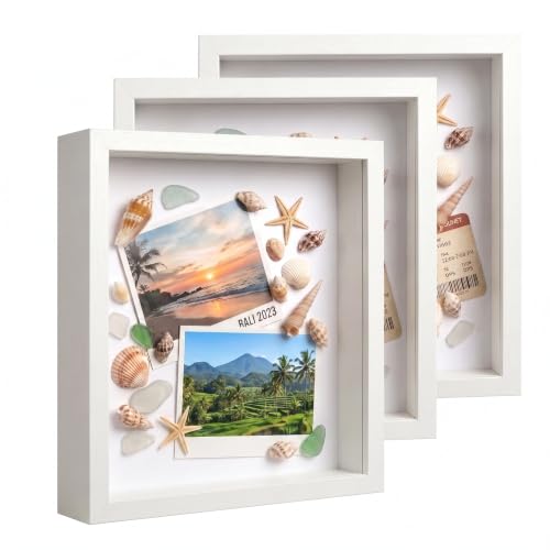
3D shadow block letters trick the eye into thinking the word is popping off the page. You draw the letter, then add a second offset outline behind it.
I always shade mine in gray because a darker version of the main color felt like too much math, lol! Kids at a birthday party sign go absolutely nuts over this trick.
- The optical illusion trick
- Second offset outline creates the pop
- Shade it darker for depth
- A hit at birthday parties
Doodle Bordered Lettering Page

Doodle bordered pages surround your lettering with tiny drawings, stars, hearts, little plants, whatever fits the mood. It’s basically a scrapbook page and a lettering piece rolled into one!
This is the style I’d hand to someone who says they can’t draw. The doodles hide any wobbly lines perfectly. Who doesn’t love a built in safety net?
- The forgiving beginner border
- Doodles hide wobbly lines
- Good for scrapbook pages
- No drawing skill required
Seasonal Autumn Leaves Lettering
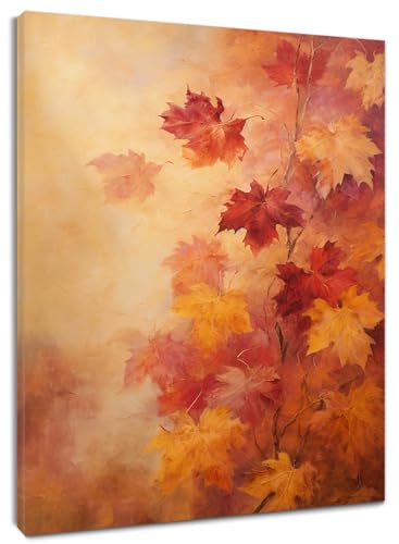
Autumn leaves lettering scatters little painted leaves across and around the word in warm oranges and reds. It practically smells like a candle just looking at it, haha!
I make a fresh batch of these every single October without fail. Great on a welcome sign near the front door.
- The seasonal front door sign
- Warm oranges and reds only
- A yearly favorite for many
Ribbon Banner Lettering Layout

Ribbon banners wrap your word across a drawn ribbon that folds back on itself at each end. Are you guys seeing how dimensional this looks with barely any extra work?
I always draw the folded ends first, then fit the letters onto the flat middle. It reads like a certificate or an old-school award.
- The certificate look for free
- Draw the folded ends first
- Reads like an award ribbon
- Fits short words best
Cursive Name Lettering Tattoo

Cursive name tattoos are basically permanent lettering, no pressure at all, lol! People bring printed samples straight from these designs into tattoo shops constantly.
I always tell friends to practice the exact flow on paper first. No one should commit to skin without a trial run!
A steady, single line usually ages better than something too fancy.
- The one people take to a tattoo shop
- Practice on paper first
- A single steady line ages well
- Popular for name pieces
Star Sparkle Lettering Accents

Star sparkle accents add tiny four point stars and little glints around your letters, usually near the tops and tails. It turns plain lettering into something that feels a bit magical!
I always save mine for last, otherwise the whole word gets crowded fast. Restraint wins every time here.
Bible Verse Lettering Bookmark

Bible verse bookmarks pack a short line of scripture into a tall, narrow strip. This one finishes during a single commercial break, haha!
Laminate it or tape it well, because purses are basically bookmark graveyards!
- The five minute purse project
- Finishes in one sitting
- Laminate for durability
- Small enough for any bag
Geometric Sans Serif Lettering Card

Last but definitely not least, we have geometric sans serif cards, clean shapes and straight lines with almost no flourish at all. This one honestly looks the most modern out of the whole bunch.
How cute is this for a housewarming gift?
A ruler helps keep everything sharp if your hand tends to wobble. It’s the style I’d pick for a housewarming card, simple and gone the moment someone opens it.
- The clean modern closer
- A ruler keeps lines sharp
- Barely any flourish needed
Just a little note - some of the links on here may be affiliate links, which means I might earn a small commission if you decide to shop through them (at no extra cost to you!). I only post content which I'm truly enthusiastic about and would suggest to others.
And as you know, I seriously love seeing your takes on the looks and ideas on here - that means the world to me! If you recreate something, please share it here in the comments or feel free to send me a pic. I'm always excited to meet y'all! ✨🤍
Xoxo Frida
Related stories
- 20+ School Office Decorating Ideas That Inspire Daily
- 20+ Overthinking Quotes That Stop Your Brain Spirals
- 19+ Adorable Cute Baby Announcement Ideas That Go Viral
- 18+ Adorable Drawing Ideas Cat Lovers Obsess Over
- 20+ Bold Man Tattoo Ideas That Command Attention
- 16+ Genius Doodle Ideas That Spark Creativity Instantly