
Skip the intro · jump to the list ↓
Once the weather cools down, everybody suddenly wants their walls to feel calmer. That’s just how it goes every fall!
The problem is most people grab whatever’s on sale and end up with a wall that feels random instead of restful. Not a great look, lol!
So this list keeps things simple on purpose. Hundreds of pins got scrolled through for this one. Only the layouts that actually work in a everyday living room made the cut.
No huge budgets required here. Most of these use frames you probably already own or can grab secondhand.
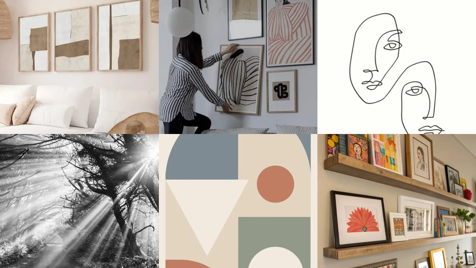
Below you’ll find muted colors, simple shapes, a few photography ideas and some shelf styling too. Pick one that fits your space, or mix a few together for the full effect!
Under each idea you’ll find the small details that actually matter, plus where to find the full how-to.
SCANDINAVIAN ART PRINT IDEAS
Neutral Toned Nordic Print Set
A neutral toned set is basically the safest bet in the whole these world. Three or four prints in beige, cream and soft gray never fight with your furniture.
Hang them at eye level with a couple inches of breathing room between each frame. It reads calm instead of cluttered.
- Neutral doesn’t mean boring
- Works with almost any furniture color
- Frames from a thrift find look just as good
Scandinavian Botanical Line Print
How pretty is this botanical line print? A single stem drawn in one continuous line feels easy but somehow still looks intentional.
This one works great in a bathroom or reading nook where a big statement piece would feel like too much.
Print it in black on cream paper for that classic Nordic contrast.
- One stem, endless charm
- Fits a narrow wall perfectly
- Printable at home in an afternoon
Muted Blue Nordic Landscape
This muted blue landscape print brings in color without shouting about it. Think foggy mountains or a quiet shoreline in soft slate tones.
It pairs beautifully with wood tones, which makes it a natural fit for a living room or a hallway that needs a little life.
- Barely there color, big impact
- Reads calm from across the room
- Pairs with warm wood frames
Nordic Style Abstract Shapes
Abstract shapes are having a real moment. This Nordic version keeps it soft. Circles, arches and simple blobs in oatmeal and rust tones.
It looks like something from a design store, yet it’s honestly one of the easier ones to recreate on your own.
- Shapes that feel like a hug
- No drawing skill required
- Looks pricier than it is
Scandinavian Gallery Wall Layout
A proper gallery wall layout is where a lot of people get nervous, am I right? The trick is sticking to a limited color palette so nothing competes for attention.
Mix a couple of different frame sizes but keep the mat color consistent throughout.
This is the layout that makes a plain wall the whole point of the room.
- The layout that ties it all together
- Same mat color keeps it cohesive
- Mix two frame sizes, never more
Hygge Inspired Print Collection
This hygge inspired collection leans into texture more than color. Think linen mats, matte frames and prints of candles or wool blankets.
It’s the kind of wall that makes a room feel warmer just by looking at it, especially once the days get shorter.
- Warmth without a single word
- Matte frames beat glossy every time
- Great above a reading chair
Danish Modern Wall Decor
Danish modern decor keeps everything low, wide and unfussy. A long horizontal print above a credenza does the job better than three small ones stacked up.
Teak frames or anything with a slight warm tone finish the look nicely.
- Low, wide and unbothered
- Fits above a credenza or console
- Teak frame from a thrift find works
Simple Line Art Faces
Simple line art faces are everywhere right now. Honestly the appeal makes sense. One continuous squiggle somehow captures an entire expression.
These work well in odd little corners where a bigger piece just wouldn’t fit.
- One squiggle, full personality
- Fits small awkward wall spaces
- Printable straight from your laptop
Continuous Line Botanical Sketch
This is where line art decor ideas really shine. A continuous botanical sketch is the easiest entry point. A single unbroken line traces out leaves and stems.
Frame it thin and simple so the line itself stays the star of the show.
It never feels dated, which is honestly rare for wall art.
- The line never lifts the pen
- Timeless, not trendy for one season
- Looks great in black or gold ink
Abstract Body Line Drawing
An abstract body line drawing brings a little edge to an otherwise soft room. It’s minimal, a bit artsy and never feels over the top.
Hang it somewhere it can breathe, a hallway or above a low bookshelf works great.
- A little edge, zero fuss
- Great conversation starter in a hallway
- Pairs well with black frame finish
Black And White Cityscape Print
A black and white cityscape print adds instant depth to a room that feels flat. Skylines, bridges, foggy streets, they all work.
Go big on this one if you can. A large single print often beats a cluster of smaller ones here.
- One big skyline says enough
- Best hung as a single large print
Monochrome Nature Photo Wall
Nature photography in black and white feels moody without trying too hard. Forest paths, ocean waves, a single tree in fog, all classics for a reason.
This is a great spot to use black and white photography wall ideas as your whole theme instead of just one accent piece.
Rotate the prints seasonally if you get bored easily. No shame in that.
- Moody, quiet and never dated
- Rotate prints by season easily
- Forest or ocean shots both work
Vintage Black White Portrait
A vintage black white portrait brings a lived-in feeling that new prints just can’t fake. Old family photos work, but so do thrifted strangers’ portraits.
That last part sounds strange, but it genuinely looks intentional once framed well.
- Someone else’s memory, your decor
- Works even with a stranger’s photo
Minimalist Typography Poster Idea
Typography posters keep things simple with a single word or short phrase in a clean font. Less is genuinely more here.
Skip anything too busy or script-heavy. A plain sans serif in black or gray reads the most Scandinavian.
- One word, zero clutter
- Plain sans serif font only
- Prints easily at home
Simple Geometric Living Room Poster
This is the spot for minimal poster ideas living room decor really needs. A simple geometric shape in a muted tone anchors an entire seating area.
It works as a solo statement piece above the sofa. No gallery wall required.
Who says a poster needs to be complicated to look expensive?
- One shape does all the work
- No complicated framing needed
Muted Palette Minimal Poster
A muted palette poster leans on tone instead of pattern. Dusty rose, sage, oatmeal, all soft enough to disappear into a wall without disappearing entirely.
This is the poster for anyone nervous about color commitment.
- Sage and oatmeal are safest bets
Layered Picture Ledge Display
Layering frames on a picture ledge is one of those tricks that instantly looks styled. Overlap two or three frames of different heights along the same ledge.
It gives you room to swap things out seasonally without hammering new holes every time.
This is honestly the easiest picture ledge styling ideas trick on this whole list.
- Overlap them and call it styled
Picture Ledge With Greenery
Adding a small plant to a picture ledge softens the whole display instantly. A trailing vine or a tiny potted succulent works great tucked in the corner.
It breaks up all the straight lines from the frames in the best way.
- A little green changes everything
- Trailing vine softens straight lines
Floating Shelf Art Arrangement
Last but definitely not least, a floating shelf arrangement gives you the ledge look without the deep lip. Mix frames, a small bowl and maybe one candle for texture.
Keep the color palette tight so the whole thing reads calm instead of busy.
This is the arrangement that photographs the best, hands down!
- Thin shelf, big personality
- Add one small bowl for texture
- Keep the palette tight throughout
Just a little note - some of the links on here may be affiliate links, which means I might earn a small commission if you decide to shop through them (at no extra cost to you!). I only post content which I'm truly enthusiastic about and would suggest to others.
And as you know, I seriously love seeing your takes on the looks and ideas on here - that means the world to me! If you recreate something, please share it here in the comments or feel free to send me a pic. I'm always excited to meet y'all! ✨🤍
Xoxo Frida
✨ Wait! Your next favorite is right here
These are the posts readers open next. See why: